
A Splash of Color
- Peach

- Jan 1, 2020
- 3 min read
Color Theory: one of the first things that artists learn when getting involved with art. When learning color theory, you learn about color schemes and what color combinations work well with the art piece. In doing so, the artwork doesn’t look like a rainbow throw up on it. That’s where color scheme analysis comes in.
There are five color schemes to choose from
Monochromatic: one color on the color wheel with its shades and tints
Analogous: three colors next to each other on the color wheel, i.e. red, red-orange, and orange
Complementary: colors directly across from each other, i.e. yellow and purple
Split Complementary: instead of opposite colors, it uses on either side of the opposite color, i.e. purple, yellow-green, yellow-orange
Triadic: three colors that are equal spaces from each other on the color wheel
Even with those color schemes, you can still have a lot of color in a piece of artwork because they also included the tints and shades of the chosen colors. Color schemes keep the artwork looking cohesive and put together.
Sketches & Ideas

Being a new piece of artwork, there’s always the sketch pages and random ideas that get put together or just don’t look how the artist wants it to look like. For my first idea, the secondary colors of orange, green, and purple, inspired me into making them into a witches’ cauldron . But it’s always better to have more ideas than one. Following up with orange, green, and purple still, my next idea was to do a three small canvas pieces of abstract shapes (inspired by some of Sol LeWitt's wall drawings) with most one color with its tints and shades and just one shape with a different color and so on.
As for a fun one, I decided to a sketch with three big bubbles, each a different color, with smaller ones that have a blend of said colors. The next sketch that come to mind goes in a much different direction with it being a skull with paint spilling out of it and a slightly bigger color scheme. So I went with the skull and used an analogous color scheme going from yellow to red.
Progress

I started by lighting sketching the basic idea on a 8'' x 10'' canvas with a light blue color pencil. By sketch with light blue, the color won’t be noticeable under the paint and not cause the paint to dull, like with the graphite of a normal pencil. With the sketch done, I being to lay down my paint, starting with the yellow and working my way down to red. But leaving orange out for now because the orange in my current possession was leaning more on the red side, making it red-orange instead of a new bright orange.
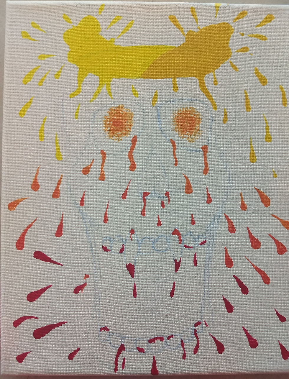
Once the yellow, yellow-orange, and red are dry, I add on the orange and red-orange around the eyes and nose area of the skull, making look a little like a gradient down the skull. For the “glowing” eyes, instead of using brush strokes, I added a little glob of paint in the middle and just dab the paint around so some white of the canvas showed. With the face being done, the background was the only thing left.

And now for the part that I was feared doing. To make the colors pop, I wanted to do a black background, which was difficult to paint into a small place because once something gets covered over with black, it can never go back to its original color without a large amount of white paint under it. Black is such a dark color that it swallows any color that it painted over. So it was difficult to paint all around the drops and not cover any of them.
Final Artwork
To finish the piece, I dabbed the black in the eyes around the orange to keep the uneven edges of the orange. After that I added pale yellow in a place that would look like shadows and on the teeth to make them pop, with a fine liner to finish them.
Personally, one of the few things that I would change on it would paint it on a bigger canvas just so I could have a few more drops of paint and open the jaw more. Adding a highlight to the paint in the skull and drops would have added more dimension and I most likely add them.
But I’m very pleased with how the painting turned out and that the black background was a struggle but worth it. And because the color leans more to the warmer tones of the color wheel, I want to make another one that involves the cooler tones.


Comments